Magazine
Too Full For Food
In charge of layout and graphic design.
A bi-monthly magazine, dispensers in some gas stations, and some cafés.


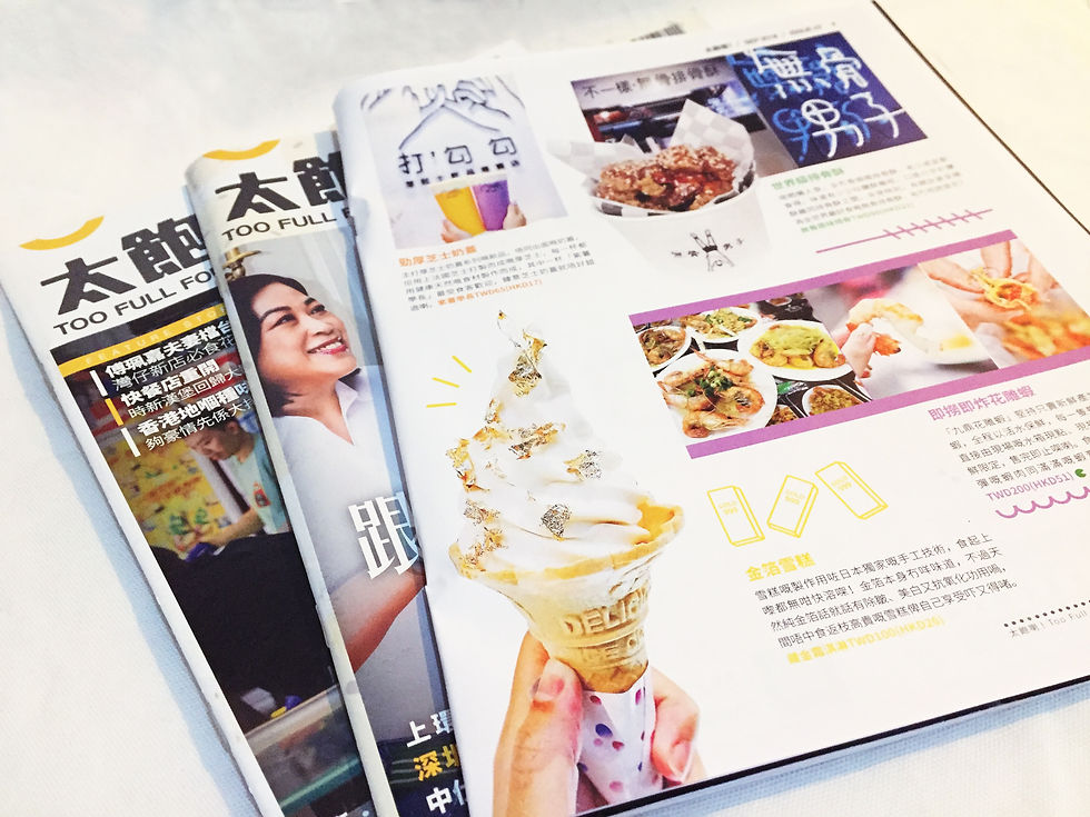
On above are those magazines I have involved in designing.
Production

Beauty Story:
Color:
Back and white, fashionable and professional
Graphics:
Checked tags and tattoos graphics give readers more ideas about the shop.
Draft, on left, shows I generate ideas of graphics.
When thinking of barber shop, I put on the elements of the tools and tattoos and drafted it out.


Here is the thumbnail to show the concept of when the old meets new in this barber industry. Stay classic, and trendy and stylish hairstyle is what the shop owner wants to pass it on and grow.


Travel:
Color:
Blue, white and black, symbols of the ocean.
And keep it simple and clear to read. E.g.: The address, with bolded black color at back, to make it readable.
Graphics:
On the left, shows the meaning of Oyako Donburi, a parent-and-child meal.
Smaller and bigger bowls above their head present how the actual Oyako Donburi should look like.
Draft on left shows how I drafted out some graphics before designing.

Style:
Create a vintage style by color grading and Polaroid frames. To raise readers’ resonances of milk tea and find related to the article.

Real HK story:
Polaroid-like Thumbnails:
Shows how the milk tea being made.
And emphasizing the details of each step and outcome.


Beauty story:
Same series from Issue 8’s Beauty topic, with using pink color to isolate the differences.
Graphics:
polishing tools related to the contents, draw attention.
on left shows the draft of layout design, with planning columns, and position of elements.

Graphics:
I got inspired by the old Hong Kong style restaurant, Bing Sat 冰室. Making it as a menu style with checked patterns, commonly used in those restaurants.
Milk tea, a classic beverage, can definitely represent Hong Kong dining culture. And the clock symbol of tea time, related to the topic.
On left, is the draft of how I brainstorming and generate the idea of layout design


Good buy


Real HK story
Neon lights are part of the Hong Kong culture, requires artists’ techniques and experiences. As same as Siu Mei, a classic HK cuisine, requires chefs’ experiences and techniques. So combining these two, tells the story of the restaurant.
Draft on left noted down with what color and graphics to apply.

Good buy:
Graphics:
Background as a $20 note, symbols of within $20, readers can enjoy those meals we recommend.
On right, is the layout draft with marking some notes of designing details


Chef story:
After brainstorming, “Dreamy style” is what I decided to introduce readers of those glamorous, elegant dishes and the story behind.
Using flower frames and water-painting brushes help to present the chef’s artwork like dishes and her story.


